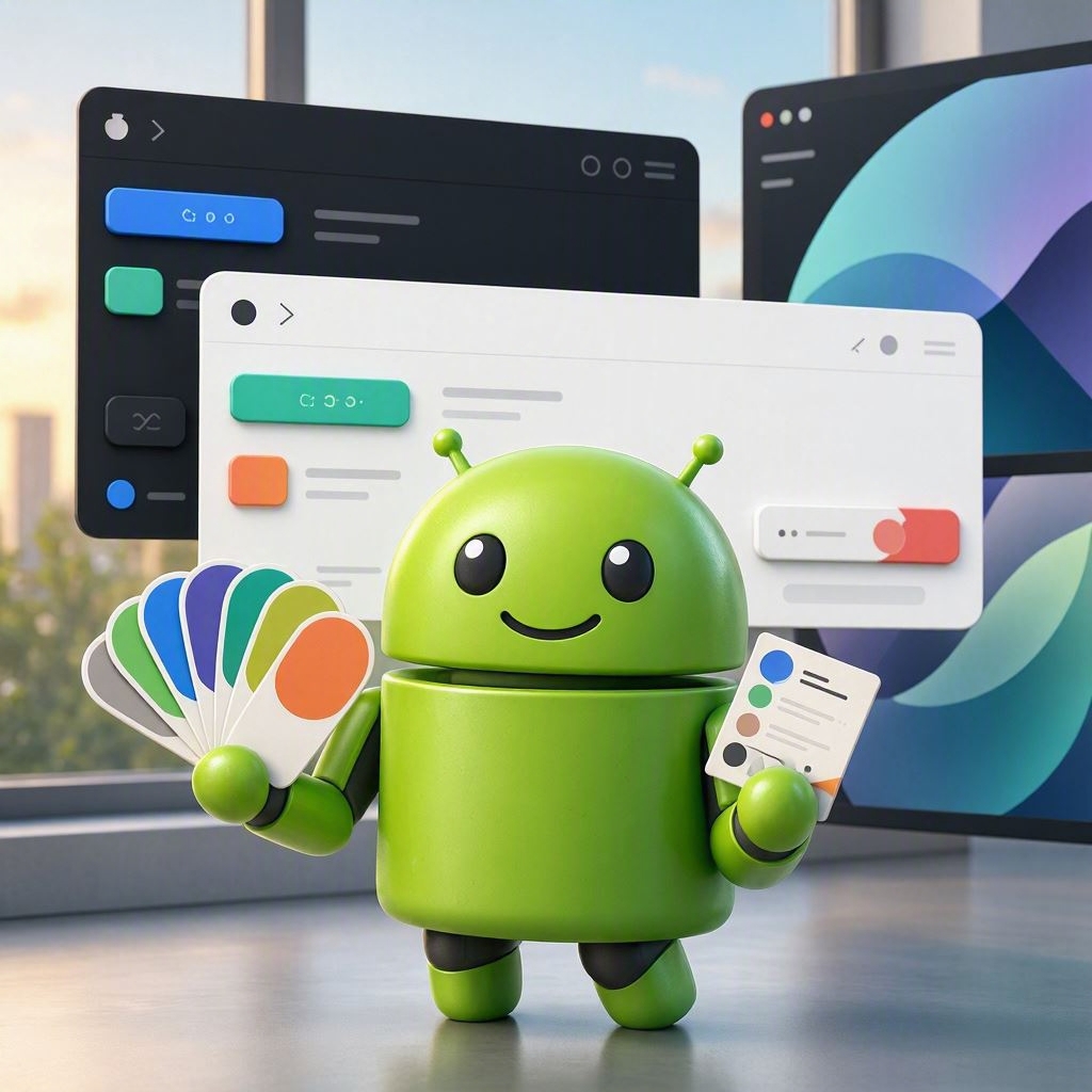
Android App Color Scheme: How to Choose the Right Colors
Welcome to the colorful world of Android app design, where choosing the right color scheme is as crucial as deciding whether to put pineapple on pizza (spoiler: it’s a hard no for some!).
So, you’ve decided to create an Android app. Congratulations! Now, before you dive headfirst into the world of coding, there’s one important question you must answer: what colors should you use? This is a decision that could make or break your app, much like choosing between a cat and a dog as your spirit animal. (Hint: the answer is always a cat.)
1. Understand Color Psychology
Colors aren’t just pretty; they have feelings too! Okay, colors don’t have feelings, but they do evoke emotions in humans. Think of colors as your app’s mood ring. Blue is calming, red is exciting, and yellow is… well, it’s like a cheerful sunbeam that just spilled coffee all over your white shirt. You want to pick a color that matches the vibe of your app. If you’re creating a meditation app, maybe avoid neon greens and hot pinks unless you want to send your users into hyperventilation.
2. Consider Your Audience
Let’s be real: your grandma probably won’t appreciate the same color palette as a 15-year-old TikTok star. Know your audience! Are you targeting hipsters, tech enthusiasts, or your mom who still thinks a smartphone is a new type of toaster? Tailor your colors accordingly. If your target market is teenagers, throw in some vibrant, eye-popping colors. If it’s for the elderly, maybe stick with softer, more muted tones (and a big, friendly font!).
3. The 60-30-10 Rule: A Color Diet
Ever heard of the 60-30-10 rule? It’s not a new diet fad, but it could help your app’s color scheme. This rule suggests that you use 60% of a dominant color, 30% of a secondary color, and 10% of an accent color. Think of it as a balanced diet for your app’s aesthetics—no one wants a color scheme that’s all carbs and no protein!
4. Test Your Colors
Choosing colors is like dating; you’ve got to try a few before you find the one! Create mock-ups of your app with different color combinations and test them out. Ask your friends, family, or that random person at the coffee shop if they like your color choices. If they cringe, it’s time to go back to the drawing board. Or just bribe them with coffee until they say they love it.
5. Accessibility is Key
Don’t be the app developer who makes users squint like they’re trying to read the fine print on a used car contract. Make sure your color choices are accessible! Use tools like color contrast checkers to ensure that your app is easy on the eyes for everyone, including those who might need reading glasses or have color vision deficiencies. Remember, your app should be welcoming, not a color-blind nightmare!
6. Keep It Simple, Smarty
In the quest for the perfect color scheme, less is often more. Avoid the urge to throw every color of the rainbow into your app. It’s not a celebration of color; it’s a design project! Stick to a few well-chosen colors that complement each other. Think of it as choosing your outfit for a first date: you want to look good, but you don’t want to resemble a walking paint palette.
7. Final Thoughts: Have Fun!
Choosing a color scheme for your Android app should be an enjoyable process, not a chore. Embrace creativity, have fun, and don’t be afraid to think outside the box (or color wheel). After all, if all else fails, you can always go with classic black and white and call it “minimalist chic.”
So, grab your color wheel and start experimenting. Your stunning app awaits, and who knows? You might just create the next big thing that gets everyone talking—just like that pineapple pizza controversy!
Happy coloring!